Beyond the Gates of Antares: Bemalte Algoryn
Warlord Games zeigen einen bemalten Trupp der Algoryn.
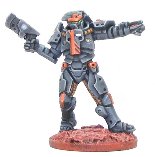
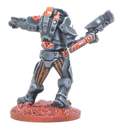
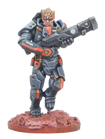
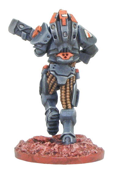
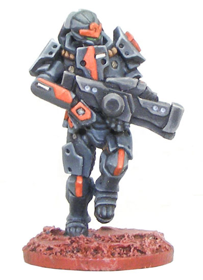
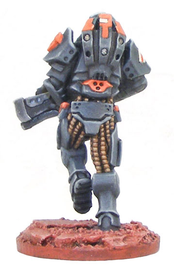
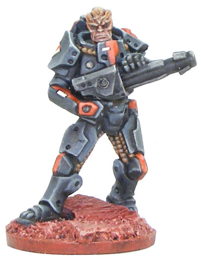
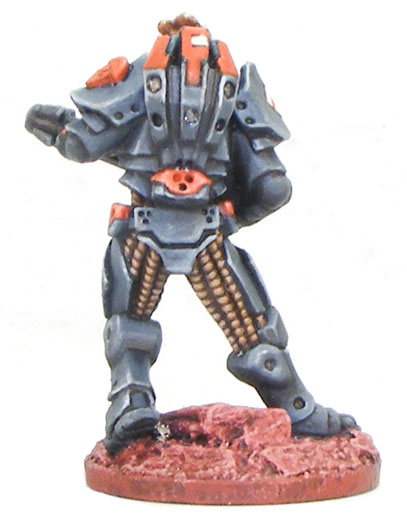
Here we have a first look at an Algoryn AI squad painted by the very talented painter Jo Bain. Not only did he paint these miniatures for the forthcoming Beyond the Gates of Antares Alpha rules he also took the time to take us through his thoughts on the colour scheme he used for his squad, so over to Jo!
From the information that is available on the Algoryn, the military culture aspect seemed defining. More than just a military unit in a regular culture it suggested a utilitarian regard for arms and armour, not a lot of frippery. On the other hand, they’d have a lot of military units so some identifying marks would be necessary.
I fancied the armour to look heavy rather than some ceremonial garb. Dark tones have a greater weight than more bouncy looking light tones, and those lads look to sporting some heavy gear by the size of the head/neck into the suit. A blue grey works nicely with white and black for the shading/highlighting and doesn’t look poncy if kept dark.
If the undersuit is lighter that helps reinforce the suggestion of heavy armour. A neutral, non-distracting shade of brown that could be as the material comes rather than dyed for cosmetic also backs up the utilitarian notion.
Weapons in factory black. Simple and strong imagery, and overly glinty metallics seemed counter to sneaky manoeuvres.
All the recessed rivets on the armour had previously got me thinking they could be glowing with light from within, the power of the power armour. That didn’t work on closer inspection, but would do for the weapons. A indicator of remaining power and glowing barrels, looked interesting. Didn’t let the notion a constant light and torch effect out the barrel bother me to running counter to those sneaky manoeuvres, figure one of the switches on the weapons can shutter that effect. Brainy eh?
Being evolved humans I didn’t deviate far with skintones. The chitinous plates were initially to go in a different direction, bone plates pushed through skin to blacken at the edges, a reverse of the typical shading/highlighting dynamic. On reflection it looked too confusing, and would be a nightmare to render if they were to also still be shaded and highlighted on top of all that. Let myself be swayed by the animals whose horns are actually made up tightly compacted hair.
Quelle: Warlord Games
In dem Dunkelrot von neulich fand ich sie schöner. Hier sind sie mir zu blass. Wobei mir die nackten Köpfe nach wie vor nicht zusagen.
Insgesamt finde ich diese Aliensoldaten ok, mehr aber auch nicht. Abseits des Antares-Systems hier wüsste ich auch nicht, wo ich die verwenden könnte.
Also echt, was erdreisten die sich Minis zu produzieren, die einen Alleistellungsmerkmal für ihr eigenes System besitzen? 😀
Die kann man doch in jedem generischen Sci Fi System verwenden. Mir fielen auf anhieb 4 ein, ohne groß nachzudenken.
Das dafür immer noch Geld verpulvert wird.
Die Idee war schon recht oldschool und das Design ist nicht mehr so wirklich zeitgemäß.
Ich glaube nicht das aus dem Spiel jemals was wird das man ernst nehmen muss.
die Waffen sehen halt mal echt übel aus… total billig und. Erinnert mich ein bißchen an die alten Heavy Metal Miniatures Reihe – und die sind 20+ Jahre alt
Ich wünsche ihnen Erfolg mit ihrer Reihe, und jeder Designer muss mal irgendwo anfangen. Leicht werden sie’s aber auf dem selben Markt, auf dem man die neuen Morat kaufen kann, sicher nicht haben. 😉
Someday… Ich freu mich drauf, denke das wird mal sehr stimmig und gut 🙂
Die Renderbilder sehen (trotz allen angeblichen Oldschool) für mich ziemlich gut aus, aber die Miniaturen finde ich etwas leer und unscharf.
@nackte Köpfe: Die weibliche Variante finde ich gut und natürlich, die männlichen sehen voll nach altem Comic aus. :/
Ich find die ganz gut. Die kann man wenigstens fertig bemalen, ohne in Details zu ersticken. Jetzt muss nur noch das Spiel was taugen.
Ka was alle haben. Die sehen doch sogar ziemlich cool aus. O.o War da der Maßstab das Problem oder was